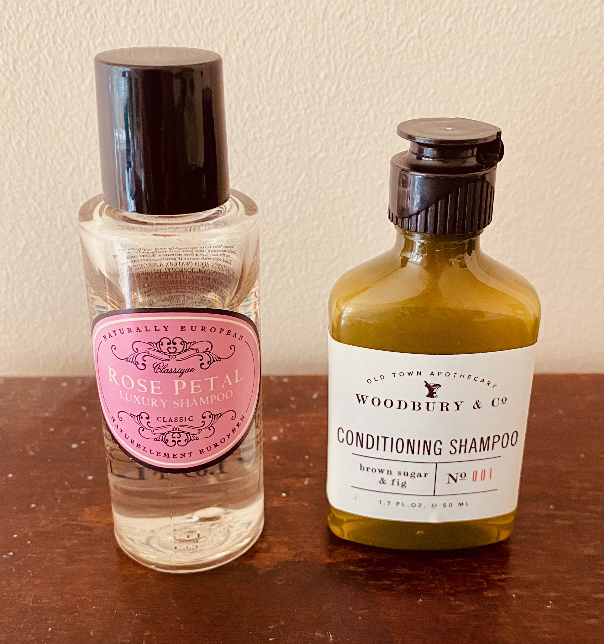
When I travel I pack small-size toiletry products. Some come from previous hotel stays, others are small sizes of favourite products I either buy in travel sets or receive as gifts with purchase.
What really annoys me though is that so many of them are not designed to be used by people who cannot see so well in the shower. When I take my glasses off I cannot see much at all. If, in addition to this, there are small fonts and bottles that are all the same design, I cannot tell the difference between shower gel and shampoo.
For me, I cannot tell the difference between the conditioner and shower gel without my glasses. Even with my glasses, I cannot tell the difference without holding them close to my face. The first problem is that the text is so small. The second problem is that the bottles are identical.
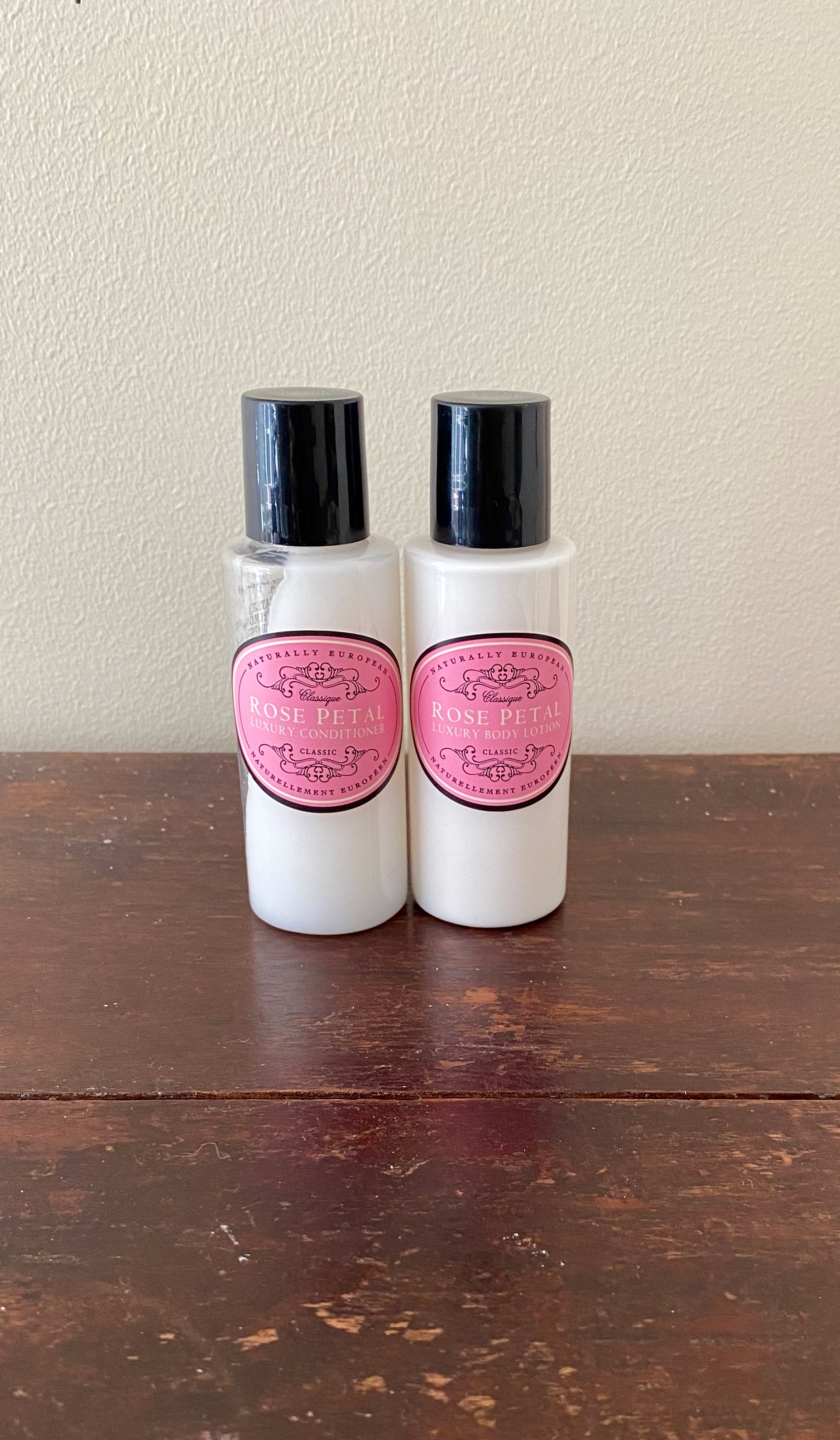
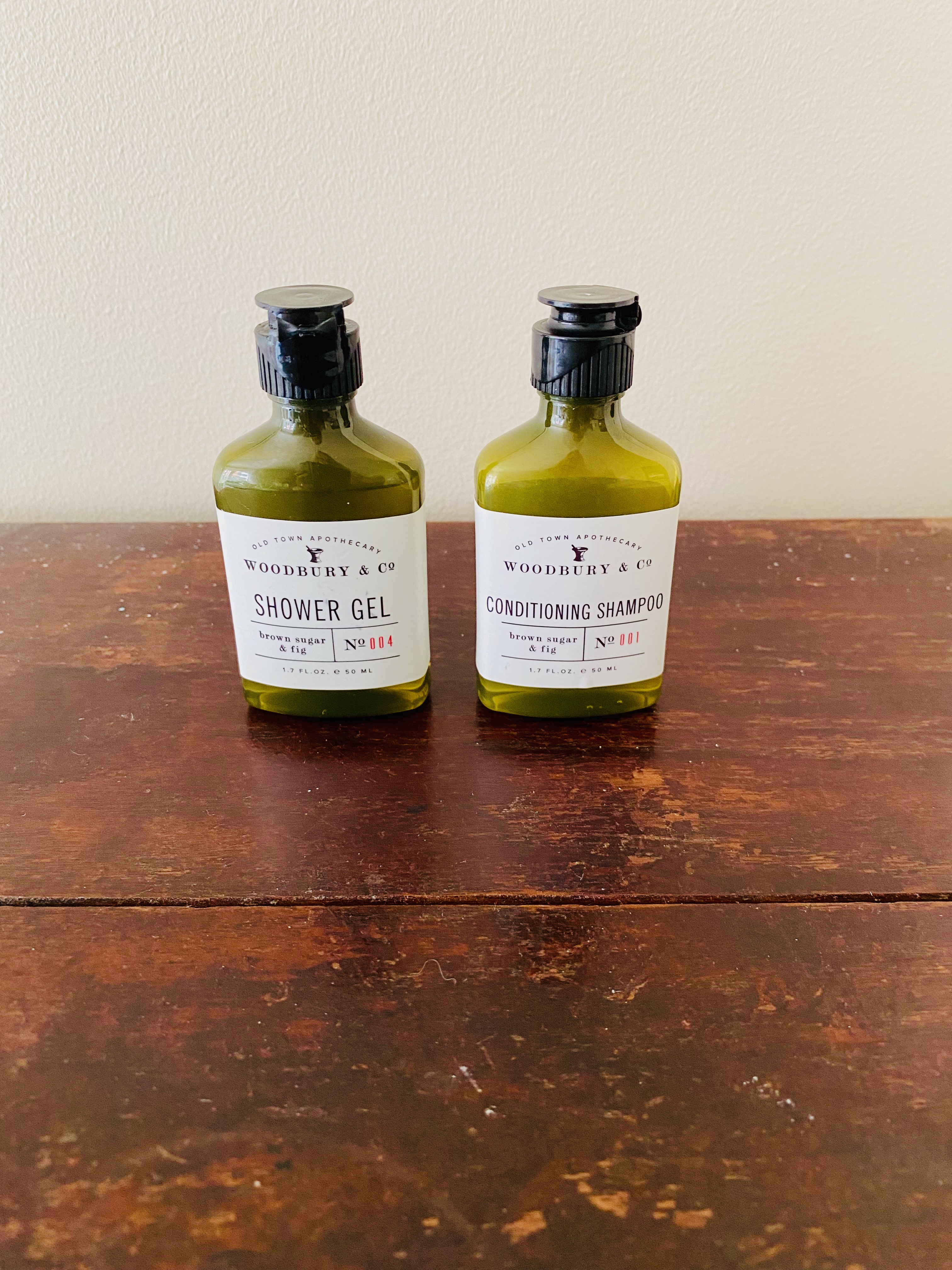
The ones below are better in that the bottles are all the same size, but you can read what it is because the font is big
And this phenomenon is not limited to travel sizes either. Here is another example of when ‘cool’ design wins out over practicality.

I avoided this problem by buying four different coloured small bottles at Daiso, green – shampoo, yellow – conditioner, blue – body wash, pink – facial cleanser. At home the brand I use has black shampoo bottles and white conditioner bottles.