It always surprises me how logos/packaging/advertisements etc can go so wrong. Large companies subcontract campaigns and designs kinds of things to experts, who charge HUGE amounts for their designs. Do they have ‘fresh eyes’ look at their campaigns? Do they do market research? Because things sometimes go very very wrong.
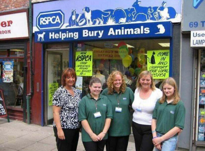
That G looks very much like a C…To be fair, Bury is the name of the town.
This hand disinfectant looks very much like a nice berry-flavoured juice pack, right?The white option made me laugh out loud!I am not sure mould-green was the best colour for their branding
Looks like the pink kid has lost his head!
They can’t afford a colour photocopier?Now that is a real throne, ha ha!EwwwMy first thought is ‘who would want to feel that hot?’. My second is, what on earth is that on the top right? I feel very old.
What is wrong with these shoes? They turn into high heels made of snow?
Just the kind of door you want in a toilet
The company couldn’t afford a real spoon for the ad?
1 person at a time…….or masks correctly, apparently
Serious question. Doesn’t the whole defeat the purpose of the mask?
phone-friendly benches…wooden coffee stirrers are made of plastic?
I must have been incorrectly taught what 90° is
That doesn’t seem the best place to put the power button…
I wonder how many people dial 0091 instead of O091?Ouch!
Fashion, beauty and animal loving language consultant from South Africa living in Stockholm, Sweden.
View all posts by Janet Carr
One thought
“What were you thinkin’?” (apparently they weren’t)
Thank you for the endorphins because I haven’t laughed this hard in a long time!!
My faves were the toilet smack-dab in the middle of the bathroom, the lockable bathroom door with the peek-a-boo bonus door, and the emergency phone (dial 999) with the 1-2-3 buttons!!
When I first saw the pink marble (in circles) in the shower stall, I thought it was attic insulation!
The black and yellow tape on the ground going every which way but loose has people not knowing whether they’re coming or going!
The head-scratcher for me was the ramp-thingy with barriers above and below it, and the graphic which started out “Love Requires” would render one insane. ??What??
The big “Ewwww” for me was what looked like hair strewn all over the table – yuck.
I don’t have vertigo, but the blue-grey and white industrial carpet steps (in a classroom setting) and the wood steps/stairs leading down into the Korean assembly/meeting room are enough to make me trip and fall down the stairs myself – how dangerous!
Your comments were wicked hilarious – that’s one of the reasons why you’re the only blogger I follow!